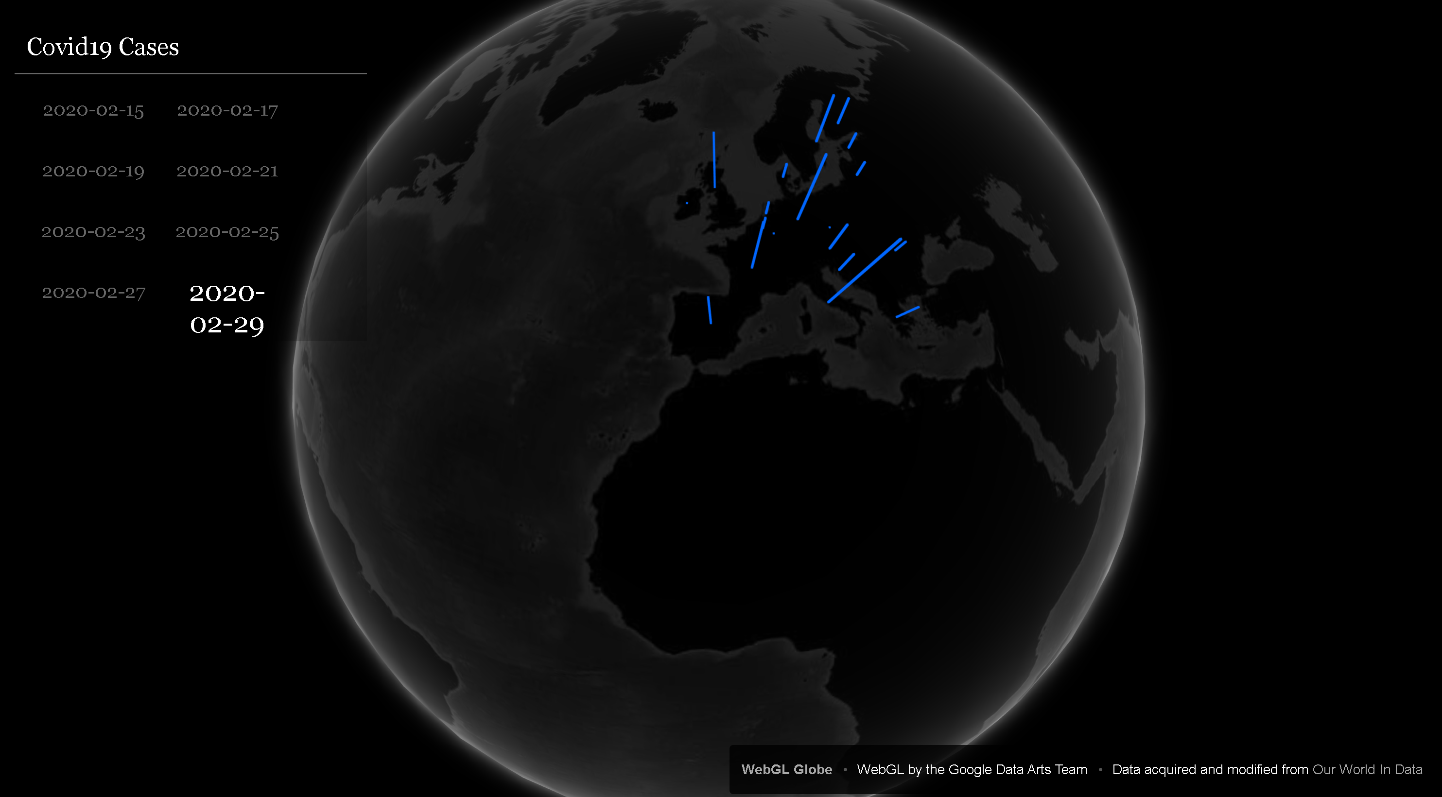
Our solution focuses specifically on how stay at home orders, and the response to those orders, has affected our climate. We focused specifically on EU Countries and the United Kingdom as our region of choice, but the data being used could be changed to observe any preferred region. We wanted our system to display data visually so it could be easily and quickly understood. Using columns on an interactive globe to indicate the severity of COVID-19 data and colour to identify levels of pollutant emissions, we were able to create a system where the severity of COVID-19 data or climate data could be easily understood regardless of training in, or familiarity with, data science.
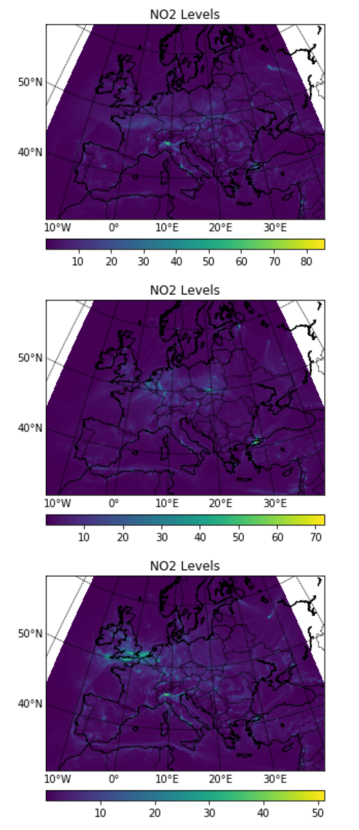
The first challenge we tackled was finding a way to compare different aspects of COVID-19's impact with climate data. By creating a system in which you could compare the number of cases, (and in the future using tests, and hospital beds) over climate data, you're able to determine the relationship between the virus and the climate, and you can determine the extent of success of a policy. For instance, if a stay at home policy were put in place, it could be deemed to be effective if both the number of cases and NO2 levels were falling, since NO2 data can be used to highlight changes in traffic emissions. By assigning country-specific longitudes and latitudes to our COVID-19 data we can successfully compare it with the information we've acquired from the ESA's Copernicus CAMS Analysis and Forecasting data.
The second solution our programme offers is a means of visualising how pollution has changed over time. We've partitioned data sets for CO2 and NO2 emission here, and these break down into different categories including emissions caused by wood building and emission caused by burning fossil fuels. For any country, the user could look at how levels of their chosen indicator of pollution have changed over the January-May period when COVID-19 became prevalent in Europe. This, compared with local policy and supply chain and manufacturing analysis (which is not often available publicly and thus not included here), could be an effective means of identifying the relationships between manufacturing, production, and supply chain mechanisms and their effects on the environment.
Another use of these data sets can be to explore where it is that pollutant emissions come from. By identifying what industries and services have been stopped, in countries that are under different lock-down measures, and comparing levels of emissions over the lock-down period, we can treat the lock-down like a natural experiment in which we can test how our atmosphere responds to changes in emissions from different sources. In our data set we have also obtained PM10 data related solely to wildfires from the Copernicus data sets that could be analysed if it was ever of interest. While not directly influential on an analysis of the interaction between COVID-19 and effects on our climate, we thought it was interesting to include to show the potential of the combination of these data sets beyond the information we've provided.
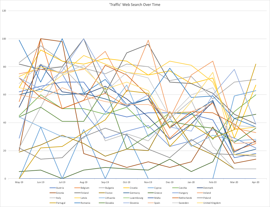
The final problem we attempted to solve, albeit only tangibly, was the problem of the lack of available public data surrounding vehicle traffic. The solution we came up with was to use Google trends to look at how searches for the word 'traffic' varied over the course of the year (from May 2019 to May 2020). Adjusting for language, we were able to offer a fair comparison between countries by showcasing the individual data points in terms of their frequency over the course of the year. Within every year there is a popularity data point of 100 where the word came up the most, as a proportion of all web sources, and there is a popularity data point of 0 where it came up a negligible number of times. In our self created data set we list the last value recorded, from the end of each month and from the available charts. The purpose of all this was to create a set of data that could depict general trends in modern transport that could be analysed alongside the NO2 data and COVID-19 developments. Changes in climate data on its own cannot be said to be an impact of COVID-19, but adding in the element of trends related to travel, can help to correlate the data in some ways. General trends in travel over time, as shown in a data set like the one we've created, can also help determine the extent to which lock-down orders are being adhered to, and helping to identify if they are in place at all.
Because all of our team members come from different academic backgrounds, we wanted to pick a challenge which we felt played to our strengths. Coming from backgrounds in computer science, maths and physics, and PPE, we realised that data analysis is one thing that each of our courses have in common. In developing this project we wanted to explore how each of us might have a different perspective on what data could be useful to discover potential links between COVID-19 and climate data, and how having different perspectives on that use of data could be crucial to uncovering really interesting connections particularly when it came to areas for which there wasn't really any accessible public data.
Our approach to developing this project was first to brainstorm an interface that would make any data we input easy to understand for the average user and experts alike. We decided that the best way to do this would be to represented the data visually with the goal of catering to those interested in understanding the impact of the virus on climate without having to understand the data. By using a model of the globe, and showing 3D columns to indicate cases and the degree of severity of COVID-19, the data can be quickly and easily understood at surface level. By comparing climate data and COVID-19 data side by side one can clearly visualise the relationship between the two. For the climate data, differing levels would be identified by colour while COVID-19 data could be modelled by column height.
Once we figured out what we wanted our project to look like, we tried to find data that would help us draw reasonable conclusions on the relationship between COVID-19 and environmental changes. We realised that focusing on the movement of people and the effects of lockdown in the EU and the UK was the most realistic goal for us, given the data that was publicly available and the time we had to come up with a solution. The first step to creating a database was to source COVID-19 data, to which we could compare climate data. We found a data set, updated daily and organised by country, from Our World In Data. Not every country is reporting their cases and testing with equal standards or as often, but the data gave us a good starting point nonetheless. The only changes we made to the initial data were to limit the number of countries down to the EU-28 and the UK, and then assigning each country their respective longitude and latitudes so we could physically place the data on our model.
Once we had COVID-19 data we decided that we wanted to focus on the effects of lockdown measures, and the effect of different lockdowns on COVID-19 cases. We gathered from the brief that NO2 data was going to be the most useful indicator to determine the degree to which lockdown had been successfully implemented, if at all, because a reduction in emissions are indicative less transport, less manufacturing, and less movement on the whole. We also wanted to include carbon data as a general measure of pollution in our atmosphere. This is where we used our data from one of NASA's agency partners. We used data from the ESA's Copernicus Satellite. Using the satellite's CAMS Air Quality Forecast Data (which also includes real values of past air quality levels) we were able to access both carbon and nitrogen dioxide data that allowed us to draw the comparisons we needed with our COVID-19 data.
Finally, we wanted an external indicator of how travel patterns have changed during the pandemic. While there's been quite a lot of news coverage and global trend data, we weren't able to locate any public data that depicted changes by country throughout the EU. So, we worked to brainstorm a way that we could depict the general trend without state provided data. By using data from Google trends we were able to create graphs that showed the general trend in the number of searches related to 'traffic' in the most commonly used language of that country (once this was determined we used Google translate, hopefully to select the correct word). The data was displayed almost in terms of rations, where the day where the date range with the highest proportion of web searches related to 'traffic' was assigned a value of 100 and so on until 0 where the proportion of searches related to 'traffic' was negligible. Because the data is grouped in time periods we did not include all of the data in our dataset, instead opting to choose the data for the time period that encompassed the end of each month (the ranges were the same across the data so this made for a fair comparison). Using this data, we were able to display graphs that matched what you would expect to see in changes in travel. For countries where lockdown was imposed, travel dropped steadily from January to May and is now on the rise. In countries where there were few/no lockdown restrictions patterns remained roughly the same. While not a perfect system, this data provided us with a means of looking at trends in travel which justified the links we could draw between climate data and COVID-19 data. We also think that using web search data could be really useful to indicate information beyond what is called for in this challenge. It could be used to identify whether or not there is fear over food security, effects of growing unemployment (e.g during the financial crisis web searches for antidepressants became more frequent as more people became unemployed), and more.
Once we'd decided our goals, we chose our development strategy. The 3D Globe model was built on a project from 'Experiments With Google' called WebGL-Globe that was developed by the Google Data Arts Team. The source is a standard HTML, CSS and Javascript combination with modifications to allow users to select dates in the last 5 months for our COVID-19 dataset. The Globe was viewed using python's built-in http.server functionality.
The data was cleaned and manipulated using python, with the pandas module, and standard math and json python libraries. The WebGL globe uses JSON data, so data was converted into that format after preprocessing. The netCDF4 python library was used to handle the Copernicus (CAMS-Europe) NO2 and Carbon Emission data, and was displayed using standard matplotlib. All python implementations are contained within a Jupyter notebook (see Github repository) for ease of development and viewing. Jupyter Labs was chosen over Jupyter Notebook due to its additional useful features.
One of the initial problems we faced was communication. Initially we tried to form a bigger team for a different challenge, but we had different ideas on what our project should look like within the group and we were unable to come to an agreement virtually. Once we split off and reconsidered our challenge choice, focusing on our individual strengths and on how we could each look at the same data differently, we gained more focus and collaboration as a team. Working together to locate and manipulate data in order to provide useful visuals helped us achieve what we set out to do, an achievement in and of itself, but it also helped us develop and refine skills related to virtual communication, data analysis, and data visualisation.
The Github Repository 'README' contains a few sentences and the screenshots below for a quick summary of the project contents.
https://ads.atmosphere.copernicus.eu/cdsapp#!/dataset/cams-europe-air-quality-forecasts?tab=overview
tps://europa.eu/european-union/about-eu/countries_en#the-27-member-countries-of-the-eu
https://developers.google.com/public-data/docs/canonical/countries_csv
https://trends.google.com/trends/explore?q=traffic
https://ourworldindata.org/coronavirus?fbclid=IwAR3-wGMMSV8Tc9vlg6pE5qja28AMnnze84GNUImDVFIl4bKzrW6HzxdXWnY
https://github.com/dataarts/webgl-globe